Loading Libraries and Dataset
In this article, we will start implementing a Churn modeling application using various machine learning algorithms. The scope of this Churn modeling application will not be limited to just using machine learning algorithms.
In addition, we will perform operations such as gaining insights from the dataset, data preprocessing, data visualization, and comparing different algorithms with different success criteria on the dataset. With this comparison process, we will see the success of each algorithm on the data with these different success criteria and then make a general evaluation.
Let’s start by explaining what Churn means, as we used in the title of our article.
What is Churn?
Terminologically, it means loss. This can be interpreted as the loss of a target data in any field. Churn in this study commonly refers to how much a business loses customers within a certain period. With Churn modeling, we can analyze the customer loss of any business. Through this analysis, businesses can predict customers who will no longer work with them.
As we perform this application, you can access the dataset we will use from here. Like our other articles, we will examine the dataset using Python on Google Colab. To do this, you first need to download the dataset from the relevant site and upload it to Google Drive. After logging into Google Colab with your Google Drive email address, you will be able to use the dataset.
After completing the steps above, we can now work with the dataset. First, we need to load the libraries we will use on the dataset. We can use the following code block for this:
!pip install researchpy
!pip install keras-tuner

import numpy as np
import pandas as pd
import seaborn as sns
import matplotlib.pyplot as plt
import warnings
import researchpy as rp
import lightgbm as lgb
warnings.filterwarnings("ignore")
from sklearn.metrics import roc_auc_score, accuracy_score, confusion_matrix,classification_report,roc_auc_score
from sklearn.model_selection import train_test_split
from sklearn.preprocessing import MinMaxScaler
from sklearn.model_selection import GridSearchCV
from sklearn.svm import SVC
from sklearn.linear_model import LogisticRegression
from sklearn.naive_bayes import GaussianNB,MultinomialNB,ComplementNB,BernoulliNB
from sklearn.metrics import roc_curve, aucroc_auc_score, accuracy_score, confusion_matrix, classification_report, and roc_auc_score will be used to measure the performance of the algorithms. We can compare the results obtained from these to see which algorithm is successful with which metric.
Since our dataset is in Excel format, we will use the read_csv method of the pandas library to load it in the Python environment. After loading our data, we will use the head method to display a specified number of data from our dataset.
data = pd.read_csv("/content/drive/MyDrive/Churn_Modelling.csv")
data.head(10)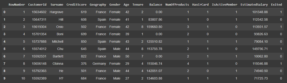
The descriptions of the parameters contained in our dataset are as follows:
| Parameter | Description |
| CreditScore | Indicates the customer’s credit score. |
| Indicates the country of the customer. | |
| Gender | Indicates the gender of the customer. |
| Age | Column indicating the age of the customer. |
| Tenure | Column indicating the working period of the customer with the bank. |
| Balance | Column indicating the balance of the customer. |
| NumOfProducts | Column indicating the number of products the customer owns. |
| HasCrCard | Column indicating whether the customer has a credit card or not. |
| IsActiveMember | Column indicating whether the customer is an active user. |
| EstimatedSalary | Column indicating the estimated annual salary of the customer. |
| Exited | Column indicating whether the customer left the bank. |
| RowNumber | Indicates the column number of the customer. |
| CustomerId | Indicates the user number of the customer. |
| Surname | Indicates the surname of the customer. |
When examining our dataset and parameters, RowNumber, CustomerId, and Surname parameters are insignificant and need to be removed from our dataset. At the same time, since the region where the person lives and their gender do not determine whether they will leave the bank, we will convert these values to numeric using One Hot transformation.
After these operations, we will group the age groups into certain intervals, convert them into categorical, and then convert them into numeric using One Hot transformation.
Before performing the operations mentioned above, let’s try to gain insights from the data.
Gaining Insights from the Dataset
We see that we have an “Exited” column in our dataset. This value indicates whether the customer left the bank or not, so by taking the sum of this column, we can obtain the total number of customers who left the bank.
INPUT:

data["Exited"].sum()

OUTPUT:


2037
We see that there are 2037 customers who left the bank in the dataset.
INPUT:

data.isna().sum()

OUTPUT:

RowNumber          0
CustomerId         0
Surname            0
CreditScore        0
Geography          0
Gender             0
Age                0
Tenure             0
Balance            0
NumOfProducts      0
HasCrCard          0
IsActiveMember     0
EstimatedSalary    0
Exited             0
dtype: int64
There are no missing values in the dataset.
INPUT:

data.info()

OUTPUT:

<class 'pandas.core.frame.DataFrame'>
RangeIndex: 10000 entries, 0 to 9999
Data columns (total 14 columns):
 #   Column           Non-Null Count  Dtype
---  ------           --------------  -----
 0   RowNumber        10000 non-null  int64
 1   CustomerId       10000 non-null  int64
 2   Surname          10000 non-null  object
 3   CreditScore      10000 non-null  int64
 4   Geography        10000 non-null  object
 5   Gender           10000 non-null  object
 6   Age              10000 non-null  int64
 7   Tenure           10000 non-null  int64
 8   Balance          10000 non-null  float64
 9   NumOfProducts    10000 non-null  int64
 10  HasCrCard        10000 non-null  int64
 11  IsActiveMember   10000 non-null  int64
 12  EstimatedSalary  10000 non-null  float64
 13  Exited           10000 non-null  int64
dtypes: float64(2), int64(9), object(3)
memory usage: 1.1+ MB
When we examine the returned values, we confirm that there are no missing values in the dataset. We can also see the data types of the columns in the dataset.
INPUT

data["Geography"].unique()

OUTPUT:

array(['France', 'Spain', 'Germany'], dtype=object)
Our dataset contains individuals from 3 different countries: Spain, France, and Germany.
To examine the distribution percentages of classes within the categorical columns in the dataset, we can use the following code block:
INPUT:

fig, axarr = plt.subplots(2, 3, figsize=(30, 10))
data["Gender"].value_counts().plot.pie(explode = [0.05,0.05], autopct = '%1.1f%%',ax=axarr[0][0]);
data["Geography"].value_counts().plot.pie(explode = [0.05,0.05,0.05], autopct = '%1.1f%%',ax=axarr[0][1]);
data["IsActiveMember"].value_counts().plot.pie(labels = ["Active","Inactive"],explode = [0.05,0.05], autopct = '%1.1f%%',ax=axarr[0][2]);
data["NumOfProducts"].value_counts().plot.pie(explode = [0.05,0.05,0.05,0.06], autopct = '%1.1f%%',ax=axarr[1][0]);
data["HasCrCard"].value_counts().plot.pie(labels = ["Yes","No"],explode = [0.05,0.05], autopct = '%1.1f%%',ax=axarr[1][1]);
data["Exited"].value_counts().plot.pie(labels = ["Not Exited","Exited"],explode = [0.05,0.05], autopct = '%1.1f%%',ax=axarr[1]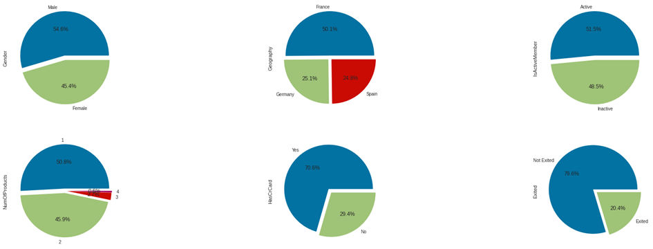
When examining the pie charts above:
- We observe that the majority of individuals in the dataset are male,
- Most of our customers are from France; additionally, the presence of French customers is almost twice that of German and Spanish customers,
- While the majority of our customers are active users, the percentage of inactive users is quite high,
- 96.7% of our customers have at most 2 products,
- The majority of our customers have a credit card,
- We can see that 79.6% of the customers in our dataset have not exited the bank.
If we want to find out how many columns and data samples are in our dataset, we can use the following code block:
INPUT:

data.shape

OUTPUT:

(10000, 14)
When the code block is executed, we get the result (10000, 14). This indicates that there are 10000 data samples and 14 columns.
In our next article, we will continue to gain insights from our dataset by visualizing the data.
You can access our next article by clicking here.